


A note from my own development file, written months ago for a film I haven't made yet: "What's the Halloween costume version of your movie? How do you dress up for Halloween as these characters? Who is the mascot? The symbol? The logo? The colors?"
I wrote those questions as a provocation to myself, and I was reminded of them recently by a video essay from Danny Boyd's channel Cinemastix on the costume design of Edgar Wright's Baby Driver (2017). The essay crystallized something I had been circling for a while: that the most legible characters in cinema are frequently those whose identity can be reduced to a silhouette and a color, and that this reduction, far from flattening them, is precisely what allows an audience to follow them through a film's most chaotic passages. What follows is my own attempt to work through why that is, and how the same principle shapes the way I approach both filmmaking and portraiture.
What color-coding a character means
Color-coding, in the context of film costume, is the practice of assigning each principal character a dominant color, or a tightly restricted palette, that persists across their wardrobe for the duration of a film. The audience is not meant to register the device consciously. Its function is perceptual rather than symbolic in the first instance: it allows the eye to locate and track a character within a crowded frame before the mind has had time to process faces, dialogue or action. Only afterward, through repetition and association, does the color begin to accumulate meaning.
In Baby Driver, Wright and his costume designer, Courtney Hoffman, applied the principle with unusual rigor. Baby, the young getaway driver, is dressed almost entirely in black, white and gray; Bats, the volatile gunman played by Jamie Foxx, in red; Buddy, played by Jon Hamm, in blue; his partner Darling in pinks and purples; and Debora, the waitress with whom Baby hopes to escape, in denim punctuated by yellow. Each character becomes identifiable at a glance, and each color, through accumulation, comes to stand for what that character represents within the story.
Why the device works
The first reason is almost embarrassingly practical, and Wright has said as much in interviews. Action cinema has a long habit of dressing everyone, protagonists and antagonists alike, in black, and when two similarly built performers in identical dark clothing collide in a fight scene, the choreography can become illegible no matter how carefully it was staged. Assigning colors restores clarity to precisely the moments in which clarity is hardest to maintain. Edgar Wright's films are celebrated for their editing, but even the most precise cutting depends upon the audience knowing whom they are watching.
The second reason is associative. Red is, of all colors, the one to which we respond most viscerally, and by attaching it consistently to Bats, the film teaches its audience to read red as danger. Once that association is established, it becomes transferable: red can migrate to other characters, other objects and other settings and carry the same charge with it, without a word of dialogue. The color has, in effect, become a piece of the film's vocabulary.
The third reason, and to my mind the most sophisticated, concerns character development. Baby stands out not because he is dressed more boldly than those around him but because he is dressed less boldly, in flat, colorless clothing without texture. He is the only principal character who has not yet decided who he is. Everyone else in the crew is fully formed and committed to the life they lead; Baby participates in crime without being hardened by it, and his black-and-white wardrobe registers that moral indeterminacy with remarkable economy. As the film progresses and Baby begins to make his own choices, that blank white shirt is literally marked by events, and he gradually takes on elements of Debora's palette, the clearest possible visual expression of where his loyalties have moved.
There is a fourth reason, which I would describe as the Halloween test. Hoffman has spoken about wanting each character to be recognizable as a costume, and that ambition is more than a marketing consideration. A character who can be reduced to a silhouette and a color has been designed with such clarity that the design itself communicates who they are. Iconic figures across the history of cinema share this quality, and color need not even be pervasive to achieve it: the girl in the red coat in Schindler's List, the one point of color in an otherwise black-and-white film, demonstrates how a single chromatic accent can carry an extraordinary moral weight. Krzysztof Kieślowski's Three Colours trilogy takes the opposite approach, organizing entire films around a single hue, and arrives at a comparable intensity of meaning.
Applying the principle in my own work
As a filmmaker, I have come to treat those development-file questions as genuine design constraints rather than idle curiosities. If I cannot describe a character's silhouette and color in a single sentence, I generally have not yet understood the character well enough to cast, dress or light them. On a micro-budget production, where there is neither time nor money for wardrobe that does not earn its place, that discipline is less an aesthetic preference than a necessity.
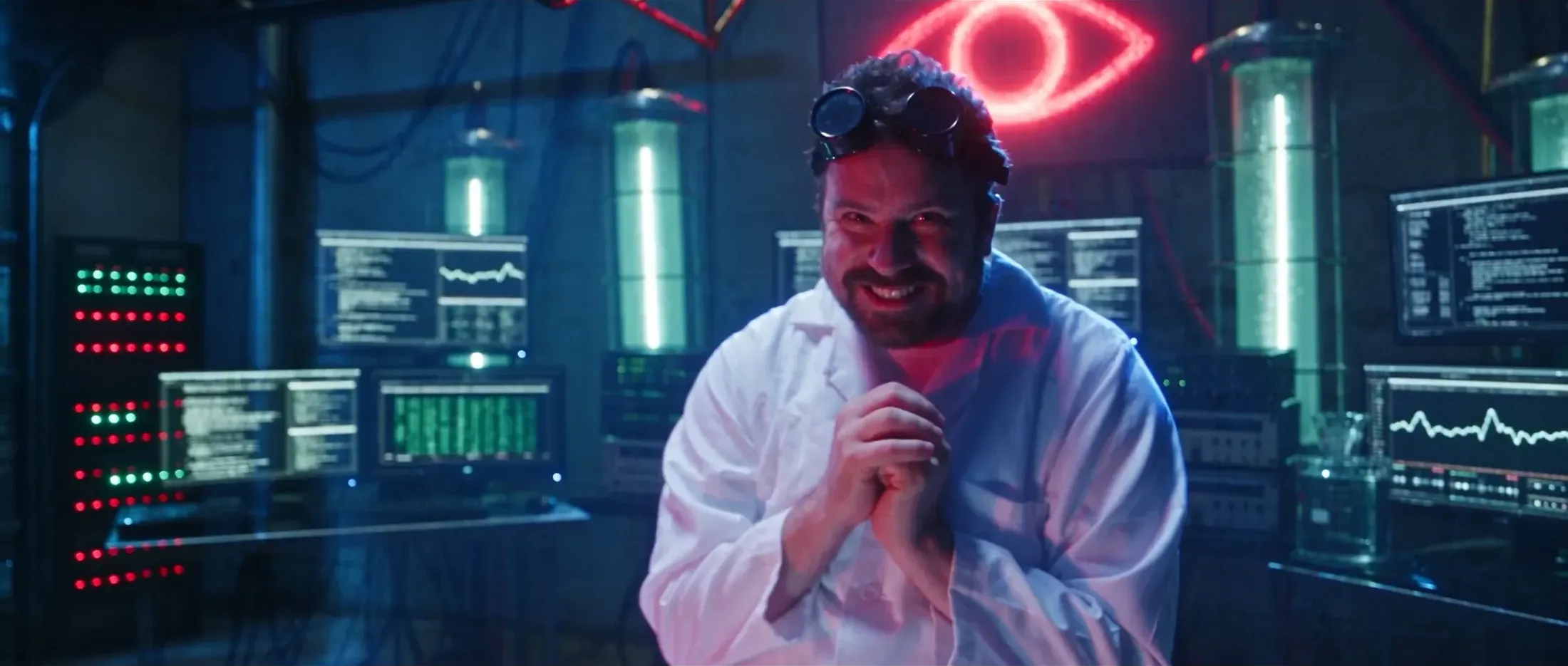
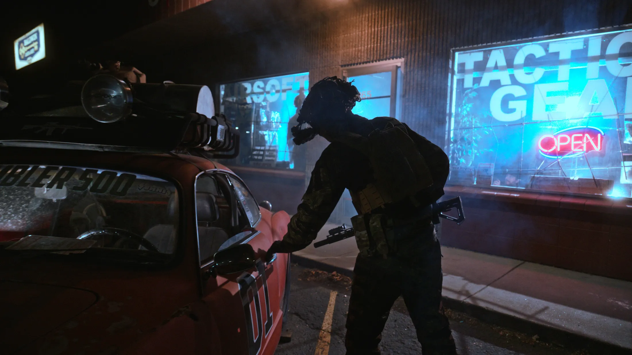
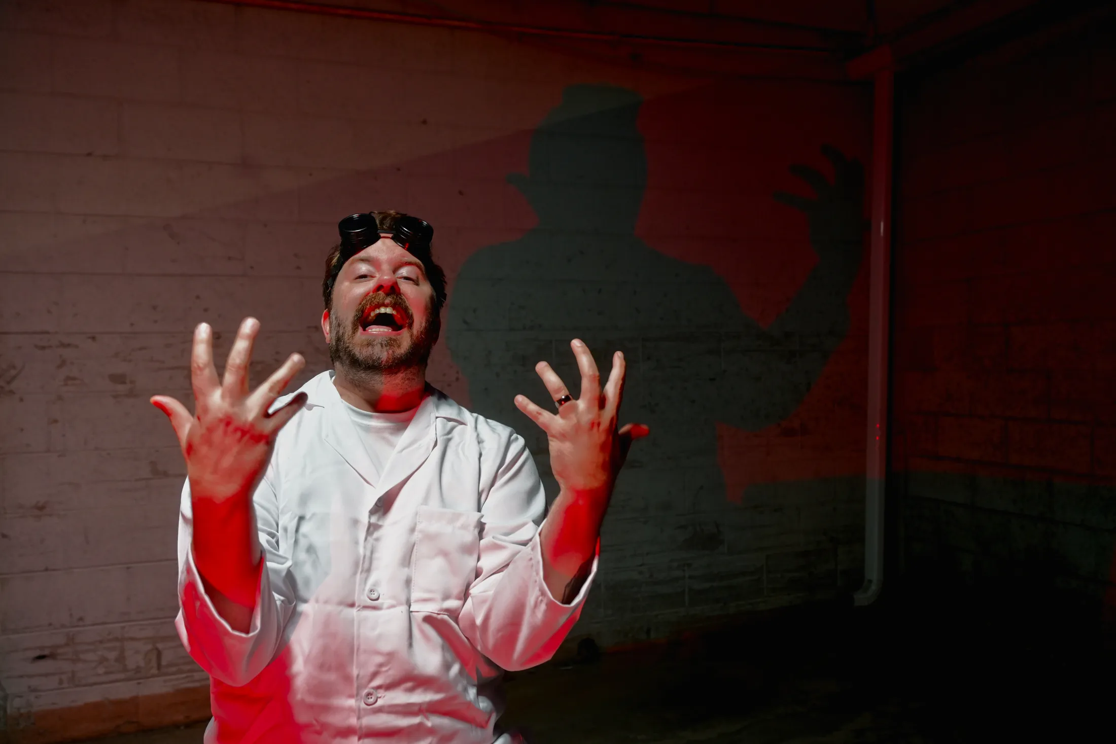
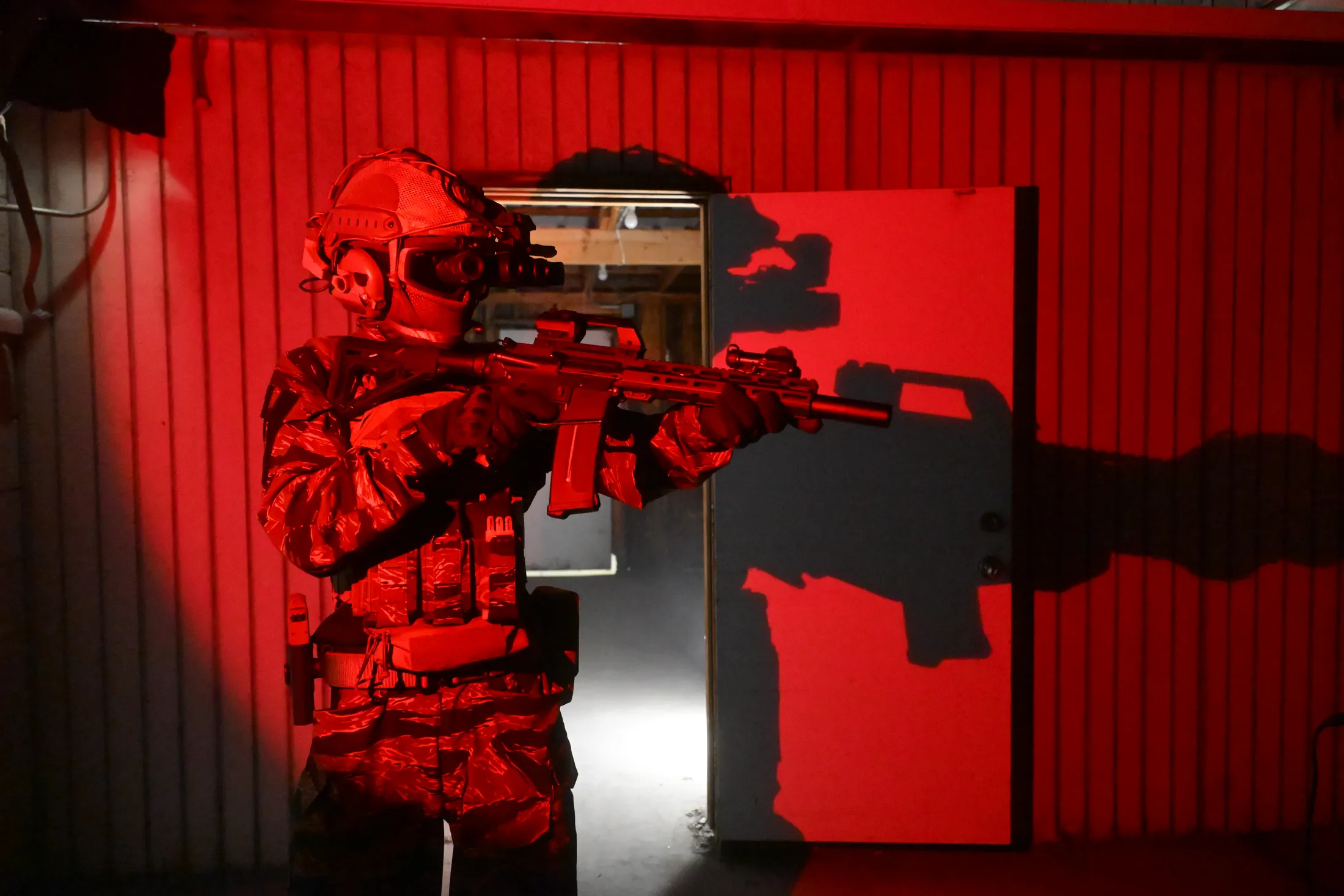
The photographs above come from a recent project of my own, a spec-ops ad I wrote and shot for Combat Sport Supply, an airsoft and tactical gear shop, and they show how deliberately the device can be built into even a short piece. The premise is deliberately pulpy: a lone commando air-assaults onto the shop at golden hour, clears it at night, and fights his way through to a back office where a mad scientist, who has announced his intention to build an AI that will take over the world, waits beside a comically oversized red button. My script introduced that villain in a single line, sitting in his office "in red lighting" and "dressed like Doc Brown," and that instruction became the organizing principle of the entire palette.
The scientist wears a white lab coat, the one bright, clean surface in an otherwise dark world, and he is consistently associated with red: the neon eye that hangs above his laboratory in "The Red Eye" and "The Laugh," the red sidelight that throws his silhouette across a cinderblock wall in "His Shadow," and the button itself in "The Button," which needs no explanation precisely because the piece has already taught us what red means. The commando, by contrast, is defined almost entirely by silhouette. His tiger-stripe camouflage, plate carrier and night-vision goggles produce an outline that reads instantly even when every interior detail has been lost, as it is against the deep blue dusk in "Blue Hour," and his world is the cool cyan of the storefront windows in "Outside the Shop." That frame is, to my mind, the clearest statement of the scheme, since the shop glows blue while red has already begun to seep in through the battered car and the neon open sign. In "Into the Red," the commando finally enters the villain's territory and is entirely engulfed by his color, the visual equivalent of crossing a threshold, with his own shadow thrown against the door behind him. None of this required a large budget; it required deciding, before a single frame was lit, which color belonged to whom.
I should acknowledge the limits of the analogy. An ad runs for a minute, not two hours, and a portrait is a single frame, so neither offers the extended narrative in which an association can accumulate the way it does in Baby Driver. A color must therefore do in a handful of shots, or in one, what a feature can accomplish across a hundred scenes, and the consequence is that color in short-form work has to be more emphatic, and more carefully considered, than it might be on screen, because there is rarely a second scene in which to reinforce it.
A practical note for portrait and couples sessions
For anyone preparing for a session, the most useful translation of these ideas is modest. Choosing a single dominant color, or a restrained palette of two or three related tones, will almost always produce stronger images than an outfit that attempts to say everything at once. For couples, the principle suggests coordination rather than matching: two complementary colors allow each person to remain distinct within the frame while still reading as a pair, which is, after all, what Wright and Hoffman achieved with Buddy's blue and Darling's pink. And for anyone who wants a portrait with a cinematic quality, the most productive question to ask before the shoot is the one I wrote for myself: if someone dressed as you for Halloween, what would they wear, and what color would it be?
More of this thinking appears in my essay on cinematic night portraits, and my film work, including the feature Opportunity, is on the film page. To plan a portrait, couples or film project in Boise and the Treasure Valley, get in touch.
Questions people ask
What does color-coding a character mean in film?
Giving each main character one dominant color, or a tight palette, that stays consistent in their wardrobe for the whole film, so the audience can track them at a glance and connect that color with what the character stands for.
What colors are the characters in Baby Driver?
Baby wears black, white and gray; Bats wears red; Buddy wears blue; Darling wears pink and purple; and Debora wears denim with yellow. The costume designer was Courtney Hoffman.
Why do filmmakers give characters signature colors?
It keeps action readable when everyone would otherwise wear black, it builds associations (red for danger, for example), it can show a character changing, and it makes a character recognizable from a silhouette alone.
How can I use color in a portrait session?
Pick one dominant color or a palette of two or three related tones. For couples, coordinate with complementary colors rather than matching, so each person stays distinct but you still read as a pair.